logo
logo
https://api.111minutes.com/wp-content/uploads/2023/07/140.webp
author icon
Author
Iryna Deremuk
Date added
15.07.2023

Flutter Widgets: Exploring the Core Building Blocks of Flutter UIs

Time to read: 7 min
Digitalisation

Google's open-source UI software development kit, Flutter, is incredibly popular among developers because it creates visually appealing and powerful applications for multiple platforms. According to a survey by Statista, 46% of software engineers used this cross-platform mobile framework from 2019 to 2022.

At the heart of Flutter lies its robust widget system—the driving force that breathes life into your app's user interface. As versatile building blocks, widgets are at the core of Flutter's expansive UI framework, enabling developers to craft compelling and engaging app experiences.

In this blog post, we’ll discover a variety of Flutter widget examples, their functions and how they play a pivotal role in creating breathtaking app interfaces.

Companies that use FlutterCompanies that use Flutter

Understanding Flutter Widgets

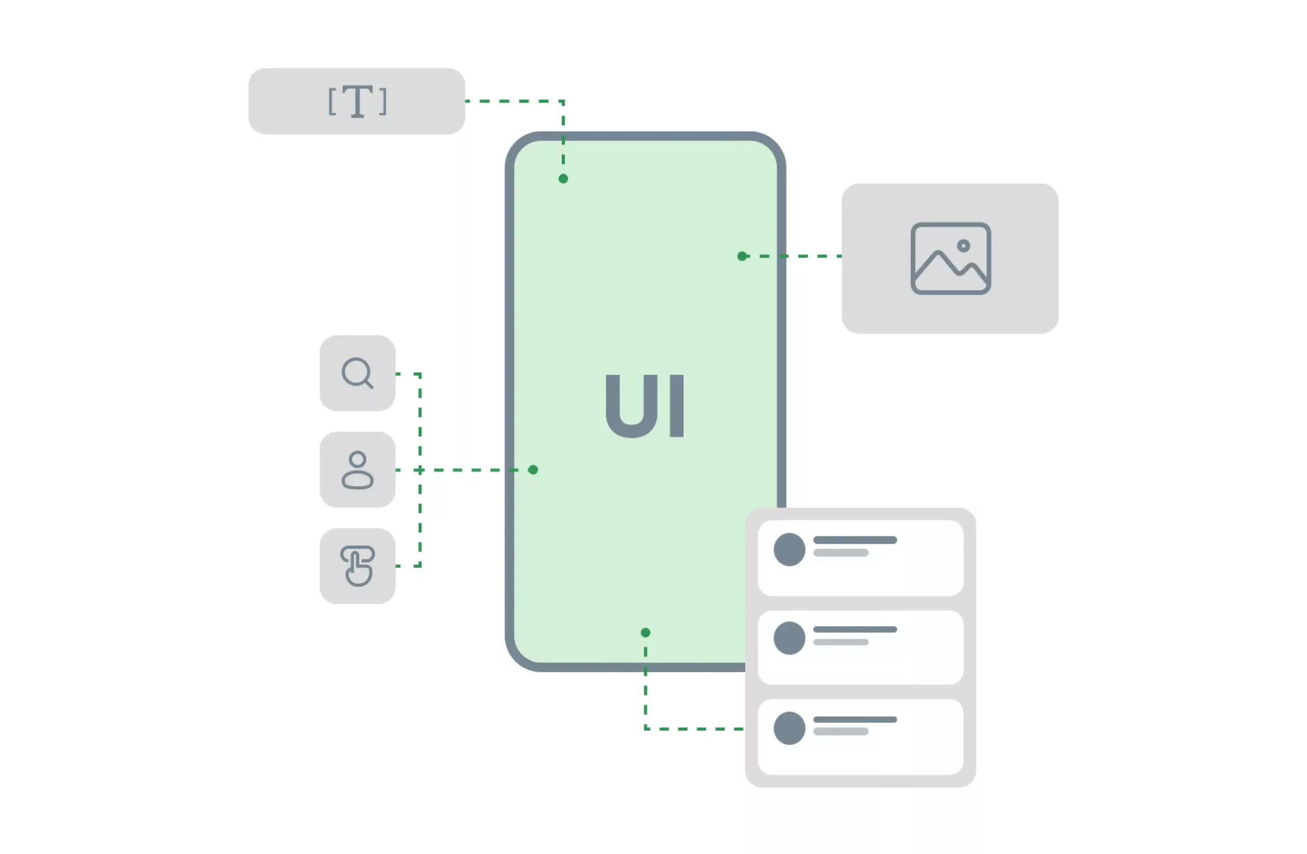
Flutter widgets serve as basic building blocks for the user interface of an application. Each of them acts as a reusable component that represents a specific element or behavior, such as a button, text input field or image. They can be combined and nested, forming a widget tree—the main widget—that determines the structure and appearance of the UI.

To fully harness the power of Flutter UI widgets, it's essential to grasp the concept of its hierarchy. The widget tree consists of nested widgets that form a hierarchical structure. Any changes in it trigger updates in its related subtree, ensuring efficient and optimized rendering.

Flutter is based on a modern framework inspired by React, and its widgets let you create your UI by assembling these components. They define the visual representation based on their current configuration and state. Whenever the state of a Flutter widget changes, its description is recreated. The framework then compares the new description to the previous one to determine the minimum changes needed in the underlying render tree for a smooth transition between states.

Flutter widgets - basic building blocks for the user interface

Types of Flutter Widgets

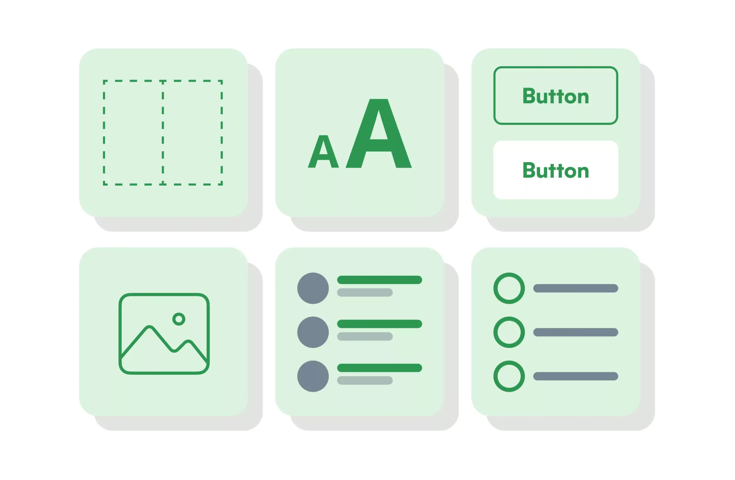
Flutter offers a wide range of ready-to-use widgets to meet the various needs of UI. Let's take a look at some of the most commonly used categories and what they can do.

Container Widgets

This is a versatile and flexible building block that allows developers to customize its size, appearance and layout properties to suit their requirements. It serves as a home for other Flutter widgets and provides features like padding, margin and alignment, which makes it indispensable for precise organization of UI.

Text Widgets

This is your go-to tool for displaying textual content on the screen. It offers developers a wealth of styling options, including font size, color and weight. With the text widget, developers can effortlessly showcase dynamic and localized text, ensuring a seamless experience for users.

In addition, some telemedicine apps go beyond just acute care visits and aim to become primary care providers. Good examples of such solutions include MDLIVE, Lemonaid and LiveHealth.

Button Widgets

Flutter custom widgets, such as ElevatedButton, FlatButton and OutlineButton, bring interactivity to your UI. With these tools, developers can customize the text, color and shape to create visually appealing and responsive buttons that engage users.

Image Widgets

These are used to display images in a Flutter application. They support various image sources, from local assets to network URLs. Leveraging the properties of this Flutter UI widget, developers can control the size, aspect ratio and orientation of the image to create visually attractive compositions.

ListView Widgets

When you face long lists that exceed screen space, the ListView widget comes to the rescue. It displays only the visible part of the list, ensuring optimal performance even with large datasets. Different types of ListView widgets, such as ListView.builder and ListView.separated, allow developers to customize the look and behavior of the list to suit their needs.

Form Widgets

Flutter simplifies collecting user input with a set of form widgets, including TextField, Checkbox and Radio. These Flutter widgets not only handle input validation and error messages, but also provide convenient callbacks to respond to user interactions. This makes creating interactive forms a breeze and improves the user experience.

Types of Flutter Widgets

Best Flutter Widgets Examples

Here is a concise list of Flutter widgets that increase software developers' productivity by helping to create intuitive, user-friendly and eye-catching UI.

Safe Area

When developing for Android and iOS, it's important to consider device-specific features. This Flutter custom widget makes sure that your app takes all the screen areas into account, including the top status bar and the bottom navigation bar, which are different sizes on different devices. By leveraging this tool, you can ensure that important content isn't affected by these areas.

IgnorePointer

In some cases, you may want to prevent user interactions with certain areas of your app. IgnorePointer allows you to make a widget and its subtree non-clickable. This can be useful for animations or specific states of the app, for example, when you don't want user interactions to interfere with the running process.

DatePicker

When collecting user data, such as a user's birthday in a shopping app, this Flutter widget simplifies the process. It opens a dialog where users can simply select a date, so it can easily be included in an app's data.

InkWell

InkWell improves user experience by adding interactivity to widgets. By wrapping it around a widget, you can define functions that will be executed when the user interacts with it, such as tapping, double-tapping or long-pressing. InkWell provides interaction feedback by default, making it a handy tool to improve user engagement.

CircularProgressIndicator

When retrieving data in an app, it's important to provide visual feedback to users during load times. The CircularProgressIndicator is a simple but effective Flutter UI widget that displays a spinning indicator while the app is actively processing data. By integrating this into your app's loading state, you enhance the user experience and show that the app is responsive.

FadeInImage

When displaying images in your app, FadeInImage ensures a smooth user experience. It allows you to show a placeholder image while the actual image is being downloaded from the backend. Once the download is complete, the new image fades in fluently, creating a visually appealing transition.

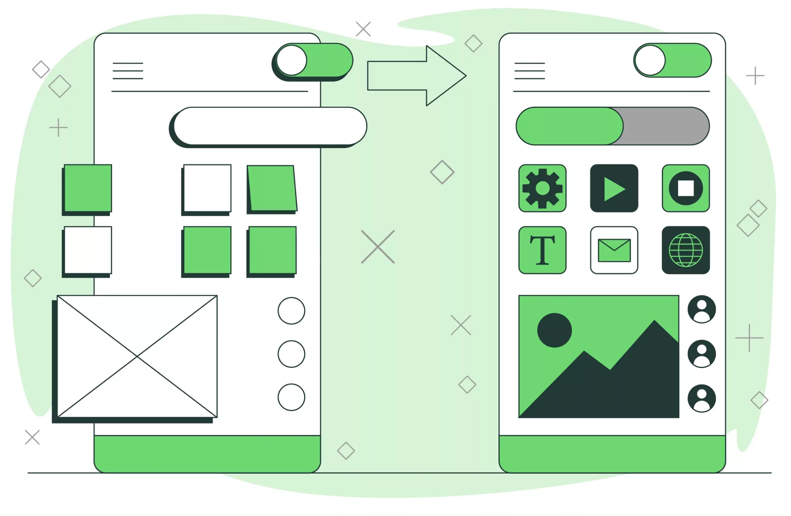
Flutter Widgets. Increasing the productivity of software developers

Wrapping Up

Flutter widgets allow developers to craft breathtaking and engaging user interfaces for various platforms. By tapping into the wide range of widgets available and understanding their capabilities, developers can create visually stunning, responsive and high-performing apps. The real power of Flutter UI widgets lies in their remarkable versatility and ease of use.

If you're planning to create a popular app with a stunning UI,
feel free to contact us.

Our seasoned Flutter developers are experts in using the best
widgets to bring even the most complicated ideas to life.

You find this article interesting ?